 Link to GENUKI
Here are some experimental logo ideas for GENUKI branding. Please note that these are not finished pieces, just concept drafts.
It seems to me that we should be aiming for something that can be (or at least seen to be minor variants when) used as:
This background on this page is a 300 pixel tile of the second offering below which has been reduced to a grey-scale and had a 95% opacity white layer placed over it.
Below are two variants I have been working on.
Link to GENUKI
This first offering has already been seen by Phil Stringer and
Brian Randell in icon form. Neither liked it but I'm including it
anyway. I still quite like the icon but it doesn't scale up to
anything much.

 Link to GENUKI
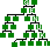
Although I can't help feeling the "Family Tree" logo concept has been rather done to death, this seems to be the best way forward. These were resized from a 300 pixel copy and some odd fringes have appeared, cleaning will have to wait, the rest of the family are starting to stir!
I think this just survives reduction to icon size (this
one is 30x32 pixels). It isn't actually important for the map outline
to be clearly visible on the icon, as long as it is recognised as such
after some exposure to the larger sized beast?
Malcolm Austen, 1998-10-25