
Dealing with content
When producing web pages it is important that HTML is used correctly to provide descriptive mark-up; HTML tags should be used to describe the nature of the content being presented (as opposed to being used solely to control how the content appears). For example, if you have a list of points, these can be included in a an unordered list. If you do not wish your list to appear with the default black bullet for each point, you can remove them using a style rule in your style sheet. In this way, meaning has been encoded into your page in a machine-readable manner. This may not immediately sound of much use, however enabling computers to understand your pages has several advantages:
- Make the text within link tags descriptive - screenreader software often provide lists of links within a page, links that say 'click here' are meaningless when rendered out of context.
- Use headers to describe the structure of your pages - most pages should have an
<h1>tag which describes the content of the page,<h2>tags are used to indicate main sections,<h3>tags for subsections, and so forth... - In general, try to use HTML tags to describe the meaning of the content, (in other words, think 'what is this?' rather than 'what do I want this to look like?' - appearance is a separate issue which can be addressed with CSS.)
It is often tempting to use HTML in order to achieve a particular visual effect, however this urge should be resisted; HTML is an instrument for encoding meaning into your web pages. If your content is marked up in a valid, meaningful fashion your pages will be more search-engine friendly and much more likely to function and display correctly across a wider range of technologies. Most importantly, your pages are much more likely to meet the University's accessibility standard. Once all this has been achieved, the appearance of the content can then be controlled using CSS.
Styling content
There are a number of CSS techniques for presenting content in an attractive manner that you can easily employ in your pages. There follows an explanation of a few (the css code for all these techniques can be found in the lookandfeel.css file):
Inline images
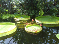
One common technique is to arrange images within the flow of the page, such that the text wraps around the image (screen-width allowing) as seen here with the photograph of Waterlillies at the Oxford botanical gardens. The image has a class attribute of "inline" specified. There are then a number of styles applied to elements of this class in lookandfeel.css:
.inline
{
border: 1px solid #000;
float:left;
margin-right: 7px;
margin-bottom: 7px;
}
The float:left; rule tells the image to flat to the left, while subsequent content flows around it. The margin-right: 7px; and margin-bottom: 7px; rules then ensure that there is some space between the floated image and the text flowing around it on the right and bottom edges. The border: 1px solid #000; puts a border around the image to provide it with more definition (this particularly helps with the presentation of the pale images).
It should also be noted that while this method can provide desirable result, as with any style rules that alter the way in which an element relates to other elements in the page (absolute positioning for example), the method should be used sparingly an cautiously. For example, this technique would not be appropriate for wide images, as this may result in an unacceptable narrow adjacent paragraph.
Panel boxes
Panel boxes can be used to draw attention to a particular piece of content you wish to highlight, or make distinct from other content in some way. The content is contained within a div with a class="panel" attribute. The div then contains an h2 tag, and any other content that you wish to place there.
This is a panel div heading
This is a paragraph inside a panel div
Lorem ipsum dolor sit amet, consectetuer adipiscing elit. Duis pede. Curabitur a pede. Nunc at augue. Aliquam ultrices adipiscing leo. Sed id diam. Cras elementum aliquam justo. Suspendisse potenti. Mauris tristique. Donec arcu. Nullam massa. Aliquam erat volutpat. Etiam ipsum. Nunc pharetra mattis leo. Proin viverra nisl id tellus tempor cursus. Ut dui mi, interdum non, luctus sollicitudin, laoreet ut, pede. Praesent vel orci. Etiam sollicitudin. Donec ullamcorper arcu ut felis.
The div is styled with with a border around it and the padding is set to 0px so that the h2 contained within the div can appear flush to the border of the div. We then set the background colour of the h2 to a dark colour that's a similar colour to the div border colour, but a bit lighter. Finally, we add some margin to any element that's likely to appear in the panel div - this is done individually so that the h2 within the panel div remains flush to the border.
/* panels stuff */


/*style a div with a border around it. Set padding to 0px
so that the h2 contained within the div can appear flush to
the border of the div */

div.panel

{


background-color:white;

padding: 0px;

clear: both;

border: 2px solid #002147;

margin: 1em;

margin-top: 2.5em;


}

/* set the  border-bottom  of the  h2 within the panel div to
be the same as the  border for the div


Set the background colour of the h2 to a dark colour that's similar to the div border colour, but a bit lighter


*/

div.panel h2

{

border-bottom: 2px solid  #002147;

color: #fff;

background-color:  #6a819c;

padding: 2px;

margin: 0px;

text-align: center;

font-size: 1.1em;


}


/* add some margin to any element that's likely to appear in
the panel div - this is done individually so that the h2 within
the panel div remains flush to the border */


div.panel p, div.panel img, div.panel h3, div.panel h4,
div.panel table, div.panel ul, div.panel form, div.panel div

{

margin: 10px;


}
Headline links
Headline links are links that you would typically include on a home page or similar style page to emphasize a particular area of your site.
This is a headline link This is another headline link ...and one more, for luckParagraphs below the links (like this one) can then be given a class="clear" to ensure that the paragraph sits below the headline links.
Headline links are simply links with a class="headline-link" which are given a border, background colour and padding-bottom set in pixels to allow room for a background image to illustrate your link. The links are also given a float:left style, so that they will wrap around each other with smaller screen-widths. The width of the link is also specified in pixels. Each headline link is then given a separate id (headline-1, headline-2 and headline-3 in the examples below.) and a different background image specified for each. In this example, all the images are 200px by 200px, though this can be altered by adjusting the width, padding-bottom and padding values (i.e. width + padding-left + padding-right = image width and padding-bottom should be slightly greater than the image height to allow some padding between the link text and the image).
/*headline links  - styles for displaying links as a headline with associated image beneath*/


a.headline-link

{

text-align: center;

display: block;

float: left;

margin: 1em;

font-family: lucida grande;

font-style: normal;

letter-spacing: 0.2em;

width: 194px;

background-color: #002147;

border: 2px solid #002147;

color: #fff;

padding: 3px;

padding-bottom: 203px;

text-decoration: none;


}


/*  change the background and border colour on mouseover or focus */

a:hover.headline-link, a:focus.headline-link

{

background-color: #6a819c;

border-color: #6a819c;

}


/* for every headline link, give it an id and then specify an appropriate image*/

#headline-1

{

background-image: url('../images/chameleon.jpg');

background-repeat: no-repeat;

background-position: bottom left;

}


#headline-2

{

background-image: url('../images/flower.jpg');

background-repeat: no-repeat;

background-position: bottom left;

}


#headline-3

{

background-image: url('../images/chillies.jpg');

background-repeat: no-repeat;

background-position: bottom left;

}