devtools::install_github("Mouse-Imaging-Centre/MRIcrotome", ref="ggMRIcrotome")I’ve been rewriting MRIcrotome, our package for visualizing brain slices, and it’s time to introduce it to the world. But first, some history and background.
Quick history of MRIcrotome
Early versions of RMINC included a way to display a slice series. While quite handy, it lacked flexibility. And so MRIcrotome was born, the portmanteau describing what it did well: describe a way to slice up 3D MRI scans to display in 2D. It was written from the ground up in grid graphics, providing ultimate flexibility in creating visualizations.
That flexibility came at the cost of having to reinvent many wheels. This was particular around legends - the code for displaying a series of slices was quite simple compared to the code of displaying the colour bar. This came to a head when I wanted to implement code to display brain segmentation outlines on top of brain slices: clearly doable, but nicely done already within many mapping libraries (such as sf) that starting from scratch seemed silly.
So I started again, inspired primarily by vaguely remembered code from Yohan Yee, who had long ago shown examples of how to display beautiful brain slices in ggplot. Additional inspiration came from ggseg, a package that does a nice job of showing 2d renderings of brain surfaces and slices, but (as far as I can tell) focuses on pre-existing atlases over flexible display of arbitrary slices and atlases.
Installation
The code still lives in its own github branch, and, full warning, the interface is most definitely liable to change. To get the current version you need the following:
You will also need the following packages installed:
- ggplot2
- sf
- terra
- tidyterra
- smoothr
- ggnewscale
For those of you on Oxford’s clusters you’ll find this development version of MRIcrotome already installed, so don’t need to do anything.
Data loading and modelling preliminaries
Before getting into visualizing let’s first load some data and run some models so that we have something to work with. I’ll work with the Sex Chromosome Trisomy mouse model, also discussed here.
# load the libraries
library(tidyverse)
library(RMINC)
# base dir where files are kept
basedir <- "/Users/jason/data/"
gf <- read_csv(paste0(basedir, "mbase-pairwise/SCT.csv")) %>%
mutate(localJacobians = paste0(basedir, localJacobians))Now let’s load the segmentations
# nlin and label file
labelFile <- paste0(basedir, "mbase-pairwise/scanbase_second_level-nlin-3_labels.mnc")
nlinFile <- paste0(basedir, "mbase-pairwise/scanbase_second_level-nlin-3.mnc")
# definition files
defs <- "/Users/jason/data/atlases/Dorr_2008_Steadman_2013_Ullmann_2013_Richards_2011_Qiu_2016_Egan_2015_40micron/mappings/DSURQE_40micron_R_mapping.csv"
abi <- "/Users/jason/data/atlases/Allen_hierarchy_definitions.json"
# load the volumes - just integrating Jacobians here, for most projects
# you'd want to use the voted labels instead
allvols <- anatGetAll(gf$localJacobians, labelFile, defs=defs)
# make the atlas definitions hierarchical
hdefs <- makeMICeDefsHierachical(defs, abi)
# and add the volumes to the hierarchy
hvols <- addVolumesToHierarchy(hdefs, allvols)And finally we can run some linear models - first at every voxel, then at every part of the segmentation. We’ll model the data as Gonads (Testes vs Ovaries) plus X and Y chromosome dose.
# load label and nlin volumes
labelVol <- mincArray(mincGetVolume(labelFile))
nlin <- mincArray(mincGetVolume(nlinFile))
# run a linear model on the relative jacobians
vs <- mincLm(localJacobians ~ G + X + Y, gf, mask=labelFile)Method: lm
Number of volumes: 181
Volume sizes: 241 478 315
N: 181 P: 4
In slice
0 1 2 3 4 5 6 7 8 9 10 11 12 13 14 15 16 17 18 19 20 21 22 23 24 25 26 27 28 29 30 31 32 33 34 35 36 37 38 39 40 41 42 43 44 45 46 47 48 49 50 51 52 53 54 55 56 57 58 59 60 61 62 63 64 65 66 67 68 69 70 71 72 73 74 75 76 77 78 79 80 81 82 83 84 85 86 87 88 89 90 91 92 93 94 95 96 97 98 99 100 101 102 103 104 105 106 107 108 109 110 111 112 113 114 115 116 117 118 119 120 121 122 123 124 125 126 127 128 129 130 131 132 133 134 135 136 137 138 139 140 141 142 143 144 145 146 147 148 149 150 151 152 153 154 155 156 157 158 159 160 161 162 163 164 165 166 167 168 169 170 171 172 173 174 175 176 177 178 179 180 181 182 183 184 185 186 187 188 189 190 191 192 193 194 195 196 197 198 199 200 201 202 203 204 205 206 207 208 209 210 211 212 213 214 215 216 217 218 219 220 221 222 223 224 225 226 227 228 229 230 231 232 233 234 235 236 237 238 239 240
Done# run a linear model on the ROIs, covarying for brain volume
hlm <- hanatLm(~ G + X + Y, gf, hvols)N: 181 P: 4
Beginning vertex loop: 590 5
Done with vertex loopIntroducing MRIcrotome and MRIcroscope
The revised MRIcrotome package separates the display of slices into two steps: (1) MRIcrotome, slicing up the 3D brain into 2D slices, and (2) MRIcroscope (sorry …) for taking those slices and displaying them using ggplot and friends on the back-end.
So let’s slice up the brain.
First we load the necessary libraries:
library(MRIcrotome)
library(terra)
library(sf)
library(smoothr)
library(data.tree)Then we slice and dice the brain
sliceList <- MRIcrotome(nlin, labelVol, hvols,
list(c(100,2), c(150,2), c(200,2), c(250,2), c(260, 2), c(300, 2), c(325,2), c(350,2), c(150,1)))MRIcrotome takes four required arguments:
- The anatomy volume.
- The label volume.
- The hierarchical label definitions.
- A list of slice locations. Each slice is itself a vector consisting of the slice number and the dimension.
Let’s take a look - we’ll show the background anatomy, an overlay of the atlas, and the ROI based output for the gonads term.
MRIcroscope(sliceList) %>%
add_anatomy(low=500, high=1400) %>%
add_roi_outline() %>%
add_roi_overlay(data=hlm, column=tvalue.GM)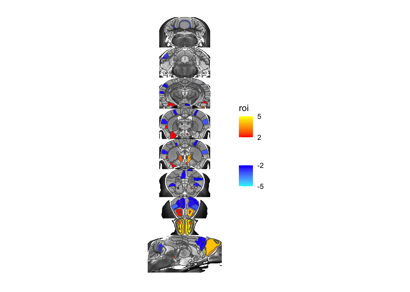
You can click on this (or any image) to get a larger preview. Also note that when you run it you’ll see some warnings about coordinate systems etc. that can be safely ignored.
For one more example let’s overlay the voxel map of the same stats term instead:
# we first have to create the overlay
voxelOverlay <- MRIcrotomeOverlay(mincArray(vs, "tvalue-GM"), sliceList$functions)
# and then add it to the plot
MRIcroscope(sliceList) %>%
add_anatomy(low=500, high=1400) %>%
add_roi_outline() %>%
add_voxel_overlay(voxelOverlay)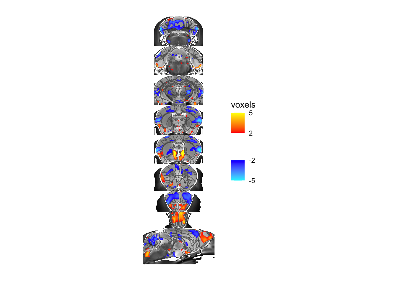
A closer look at MRIcrotome
In the example above we gave MRIcrotome a series of slices, but otherwise left the defaults alone. In that case it took the 2D slices out of the 3D brain, shrunk each slice to the extents of the labels, smoothed the labels a bit to make them prettier, and arranged it along the vertical (Y) axis. All these choices are controllable. Let’s take the same slices but now assemble them along the X axis:
sliceList <- MRIcrotome(nlin, labelVol, hvols,
list(c(100,2), c(150,2), c(200,2), c(250,2), c(260, 2), c(300, 2), c(325,2), c(350,2), c(150,1)), assembleDir = "X")
MRIcroscope(sliceList) %>%
add_anatomy(low=500, high=1400) %>%
add_roi_outline() %>%
add_roi_overlay(data=hlm, column=tvalue.GM)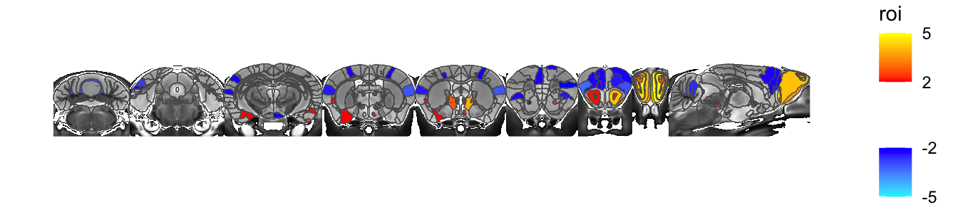
The spacing is awkwardly tight, so let’s add a bit of space between each slice
sliceList <- MRIcrotome(nlin, labelVol, hvols,
list(c(100,2), c(150,2), c(200,2), c(250,2), c(260, 2), c(300, 2), c(325,2), c(350,2), c(150,1)), assembleDir = "X", sliceOffset = 5)
MRIcroscope(sliceList) %>%
add_anatomy(low=500, high=1400) %>%
add_roi_outline() %>%
add_roi_overlay(data=hlm, column=tvalue.GM)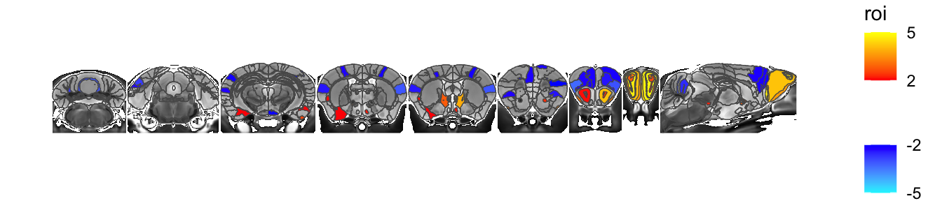
We can also avoid shrinking each slice to its labels entirely (though it still shrinks it to the 3D bounding box, just not separately for each slice)
sliceList <- MRIcrotome(nlin, labelVol, hvols,
list(c(100,2), c(150,2), c(200,2), c(250,2), c(260, 2), c(300, 2), c(325,2), c(350,2), c(150,1)), assembleDir = "X", shrinkToPols = F)
MRIcroscope(sliceList) %>%
add_anatomy(low=500, high=1400) %>%
add_roi_outline() %>%
add_roi_overlay(data=hlm, column=tvalue.GM)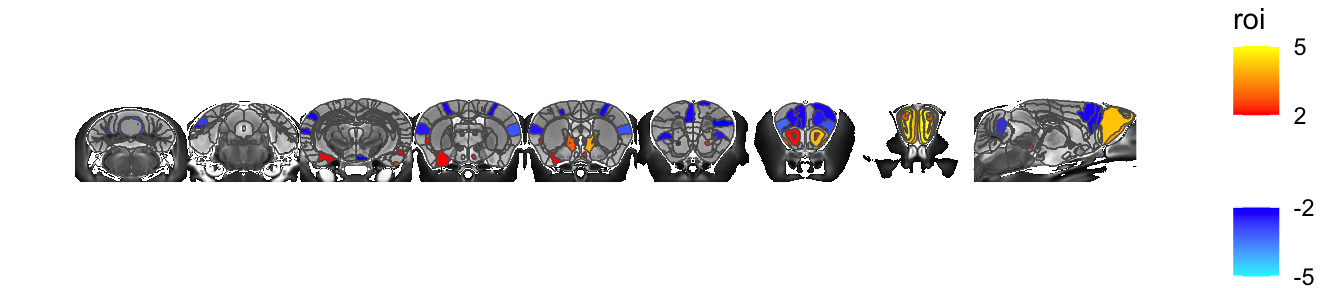
You can also arrange slices in a matrix by including a third element to the list of slices.
sliceList <- MRIcrotome(nlin, labelVol, hvols,
list(c(100,2,1), c(150,2,1), c(200,2,1), c(250,2,1), c(260, 2,1), c(300, 2,1), c(325,2,1), c(350,2,1), c(110,1,2), c(150,1,2), c(190,1,2), c(90,3,3), c(120,3,3), c(150,3,3)), sliceOffset = 5,)
MRIcroscope(sliceList) %>%
add_anatomy(low=500, high=1400) %>%
add_roi_outline() %>%
add_roi_overlay(data=hlm, column=tvalue.GM)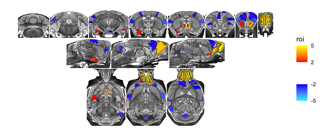
The layout when the extra dimension is added is not yet all that customizable. It arranges in X first, and then adds on rows. Making this more flexible is somewhere on the todo list. Also on the todo list are accessory functions that make creating these lists of slices less tedious. For the moment you have to roll those by hand. Take for example an m x n matrix of slices:
listOfSlices <- seq(100, 350, length.out=20) %>% imap(~ c(round(.x), 2, (.y-1) %% 4))
sliceList <- MRIcrotome(nlin, labelVol, hvols, listOfSlices, sliceOffset = 5, shrinkToPols = F)
MRIcroscope(sliceList) %>%
add_anatomy(low=500, high=1400) %>%
add_roi_outline() %>%
add_roi_overlay(data=hlm, column=tvalue.GM)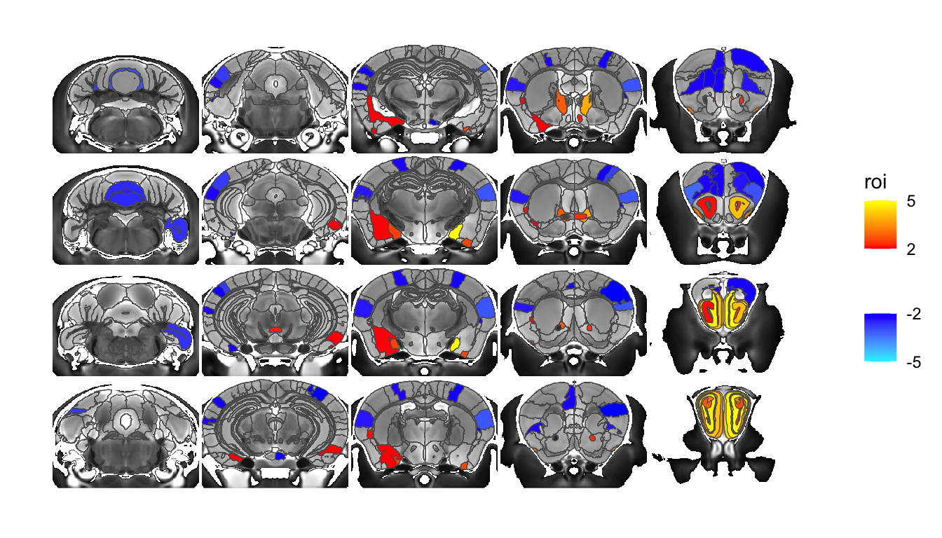
Let’s take a look at the polygon smoothing options. To make it easier to see I’ll go to a single coronal slice, showing the defaults.
sliceList <- MRIcrotome(nlin, labelVol, hvols, list(c(250,2)))
MRIcroscope(sliceList) %>%
add_anatomy(low=500, high=1400) %>%
add_roi_outline()
Why do we smooth? Let’s turn it off:
sliceList <- MRIcrotome(nlin, labelVol, hvols, list(c(250,2)), smooth = F)
MRIcroscope(sliceList) %>%
add_anatomy(low=500, high=1400) %>%
add_roi_outline()
With smoothing off the boundaries follow the voxel outlines, resulting in a stepped appearance. It’s not too bad here at 40 micron resolution, but can be quite noticeable at lower voxel sampling.
The smoothing algorithms, taken from smoothr, is not ideal, in that it smooths each polygon separately. That means as we turn up smoothing polygons being to separate. Let’s see:
sliceList <- MRIcrotome(nlin, labelVol, hvols, list(c(250,2)), smoothness = 10)
MRIcroscope(sliceList) %>%
add_anatomy(low=500, high=1400) %>%
add_roi_outline()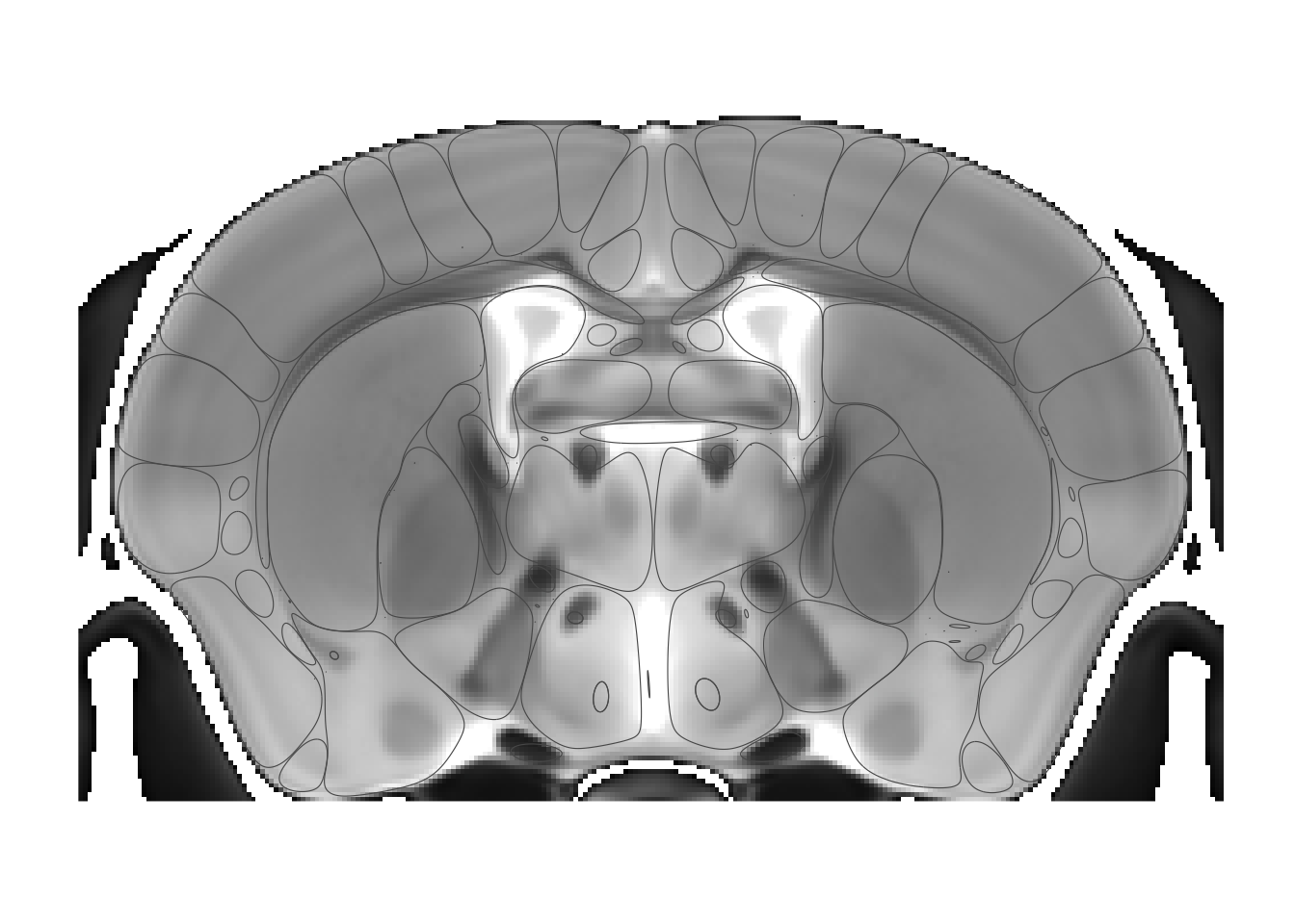
This is clearly over the top, but makes the point. The default smoothing of 1.5 tends to work well especially at high resolution, but keep it in mind if labels begin to look wonky. (And finding a better smoothing algorithm that works across multiple polygons is somewhere on the todo list).
MRIcroscope and ggplot
MRIcroscope is still fairly underdeveloped, meant to act as a convenience wrapper around ggplot (and ggplot extensions) functions. This means you can start off with MRIcroscope wrapper functions and finish off with ggplot functions, for example:
# same sliceList as before, but let's mask the anatomy volume too
sliceList <- MRIcrotome(nlin * (labelVol>0.5), labelVol, hvols,
list(c(100,2), c(150,2), c(200,2), c(250,2), c(260, 2), c(300, 2), c(325,2), c(350,2), c(150,1)), sliceOffset = 5)
# recreate the voxel overlay
voxelOverlay <- MRIcrotomeOverlay(mincArray(vs, "tvalue-GM"), sliceList$functions)
# set a base plot to expand on.
basePlot <- MRIcroscope(sliceList) %>%
add_anatomy(low=500, high=1400) %>%
add_roi_outline()
# add a title using ggplot's ggtitle function
pROI <- basePlot %>%
add_roi_overlay(data=hlm, column=tvalue.GM, name="t-stat") +
ggtitle("ROI")
# add a title to the voxel plot
pVoxel <- basePlot %>%
add_voxel_overlay(voxelOverlay, name="t-stat") +
ggtitle("Voxel")
# now combine them with patchwork
library(patchwork)
pROI + pVoxel + plot_layout(guides = "collect")
Notice the weird mixing of tidyverse pipes and ggplot pluses.
The opportunities that this presents is the whole reason for the MRIcrotome rewrite.
The data structure produced by MRIcrotome is fairly straightforward. The anatomical MRI is represented by a terra raster object called anatomy, i.e. sliceList$anatomy. The segmentation is stored inside data, i.e. sliceList$data, which in turn has the actual polygons in sliceList$data$geometry and other information, such as the region name and the acronym, in their own data frame i.e. sliceList$data$region. The format is adapted from ggseg, so most ggseg functions will also work with the MRIcrotome output.
I will end this section with three more examples of creating a plot without leaning on the MRIcrotome functions. First I’ll show the atlas with its original colours displayed halfway transparent just because.
library(tidyterra)
library(ggnewscale)
# start with a plain ggplot call
ggplot() +
# use a function from tidyterra to display the anatomy
geom_spatraster(data=sliceList$anatomy) +
# set the grayscale fill colours
scale_fill_gradient("anatomy", na.value = "transparent",
low = "black", high = "white", limits = c(500, 1400), guide="none") +
# tell ggplot that the next fill will be independent
new_scale_fill() +
# fill by ROI region name
geom_sf(data=sliceList$data, aes(fill=region), alpha=0.5) +
# use the colours from the atlas
scale_fill_manual(values=sliceList$palette) +
# turn off the background guff
theme_void() +
# turn off the legend
theme(legend.position = "none")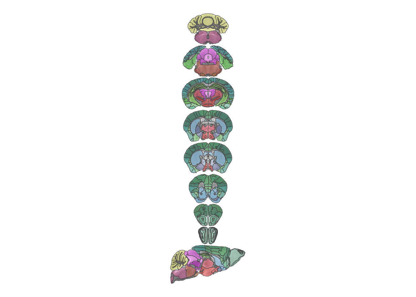
Next I’ll incorporate ggplot’s faceting mechanism to show multiple outputs side by side. This one is a bit more complicated as we first have to massage the data into the right format (which is begging to be turned into some more straightforward functions, which is somewhere on my todo list).
# get the different outputs from the hierarchical linear model
statsCols <- ToDataFrameTable(hlm, "name", "tvalue.GM", "tvalue.X", "tvalue.Y")
# now join them with the geometry
statsCols <- inner_join(sliceList$data, statsCols, by=c(region="name"))
# now we need to turn it into a long data frame
statsCols <- statsCols %>%
pivot_longer(cols=c(tvalue.GM, tvalue.X, tvalue.Y), values_to = "tstat", names_to = "statistic")
# now we are ready to plot
# start with a plain ggplot call
ggplot() +
# use a function from tidyterra to display the anatomy
geom_spatraster(data=sliceList$anatomy) +
# set the grayscale fill colours
scale_fill_gradient("anatomy", na.value = "transparent",
low = "black", high = "white", limits = c(500, 1400), guide="none") +
# tell ggplot that the next fill will be independent
new_scale_fill() +
# plot the stats
geom_sf(data=statsCols, aes(fill=tstat)) +
# use the positive and negative colours provided by MRIcrotome
scale_fill_posneg("t-statistic", low=2, high=5) +
# and facet by statistic
facet_grid(~statistic) +
# and turn off graphic gunk
theme_void()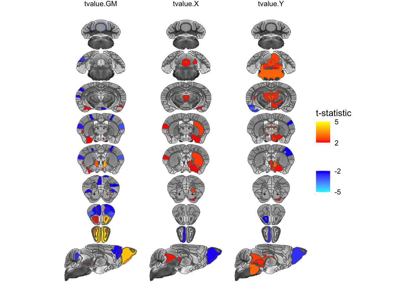
Doing this for voxels is very similar in spirit, slightly different in detail. We have to turn each bit into a terra raster object by following the same transformations as used in first creating the slice series, convert it to a data frame, then we make sure to add a name to each stat, and then we concatenate the rows.
tGM <- mincArray(vs, "tvalue-GM") %>%
MRIcrotomeOverlay(sliceList$functions) %>%
as.data.frame(xy=T) %>%
mutate(statistic="GM")
tX <- mincArray(vs, "tvalue-X") %>%
MRIcrotomeOverlay(sliceList$functions) %>%
as.data.frame(xy=T) %>%
mutate(statistic="X")
tY <- mincArray(vs, "tvalue-Y") %>%
MRIcrotomeOverlay(sliceList$functions) %>%
as.data.frame(xy=T) %>%
mutate(statistic="Y")
stats <- rbind(tGM, tX, tY)
# now the plot
ggplot() +
# use a function from tidyterra to display the anatomy
geom_spatraster(data=sliceList$anatomy) +
# set the grayscale fill colours
scale_fill_gradient("anatomy", na.value = "transparent",
low = "black", high = "white", limits = c(500, 1400), guide="none") +
# tell ggplot that the next fill will be independent
new_scale_fill() +
# add the atlas outlines
geom_sf(data=sliceList$data, fill=NA) +
# add the voxels
geom_tile(data=stats, aes(x=x, y=y, fill=lyr.1)) +
# use the positive and negative colours provided by MRIcrotome
scale_fill_posneg("t-statistic", low=2, high=5) +
# and facet by statistic
facet_grid(~statistic) +
# and turn off graphic gunk
theme_void()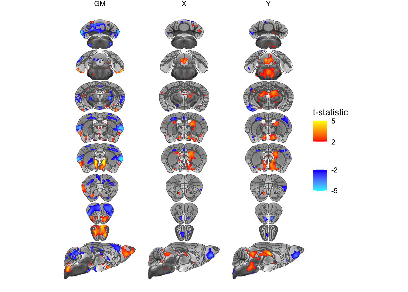
And one final example in this section. Let’s go back to the ROI and add some labels of the most significant bits of the brain. To make this more attractive let’s go back to a horizontal layout. We’ll also modify it a bit by only dealing with a symmetric atlas. We’ll start with MRIcroscope functions to both save some typing and to illustrate once again that the two can be freely mixed:
library(ggrepel)
hlmSym <- Clone(hlm)
hlmSym$Prune(function(x) !str_starts(x$name, "right") & !str_starts(x$name, "left"))[1] 308sliceList <- MRIcrotome(nlin, labelVol, hlmSym,
list(c(100,2), c(150,2), c(200,2), c(250,2), c(260, 2), c(300, 2), c(325,2), c(350,2), c(150,1)), assembleDir = "X", sliceOffset = 5)
hlmData <- ToDataFrameTable(hlmSym, "name", "tvalue.GM") %>%
inner_join(sliceList$data, by=c(name="region"))
MRIcroscope(sliceList) %>%
add_anatomy(low=500, high=1400) %>%
add_roi_overlay(data=hlmSym, tvalue.GM, low=2, high=5) +
geom_label_repel(data = hlmData %>% filter(abs(tvalue.GM)>3),
aes(label=acronym, geometry=geometry),
stat="sf_coordinates",
force=100,
max.overlaps = 100,
ylim=c(-500, 0)) +
coord_sf(ylim=c(-500, 300))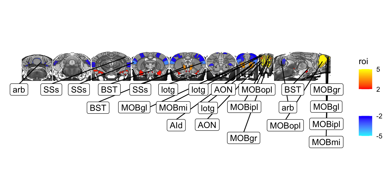
This is a bit messy, so let’s refine to add some labels on top of the slices and some below. For that we’ll have to compute the centroids of each object to decide where to put them. Let’s also use the actual names rather than acronyms.
# lets compute the centres
hlmData$ycentre <- map_dbl(st_centroid(hlmData$geometry), ~ .x[2])
# let subset to larger effect ROIs from the beginning
hlmData <- hlmData %>% filter(abs(tvalue.GM)>3)
# compute the median y centre
medianY <- median(hlmData$ycentre)
maxY <- st_bbox(sliceList$data)$ymax
MRIcroscope(sliceList) %>%
add_anatomy(low=500, high=1400) %>%
add_roi_overlay(data=hlmSym, tvalue.GM, low=2, high=5) +
geom_label_repel(data = hlmData %>% filter(ycentre < medianY),
aes(label=name, geometry=geometry),
size=2,
stat="sf_coordinates",
force=1000,
max.overlaps = 100,
ylim=c(-500, 0)) +
geom_label_repel(data = hlmData %>% filter(ycentre >= medianY),
aes(label=name, geometry=geometry),
size=2,
stat="sf_coordinates",
force=1000,
max.overlaps = 100,
ylim=c(maxY, maxY+500)) +
coord_sf(ylim=c(-500, maxY+500))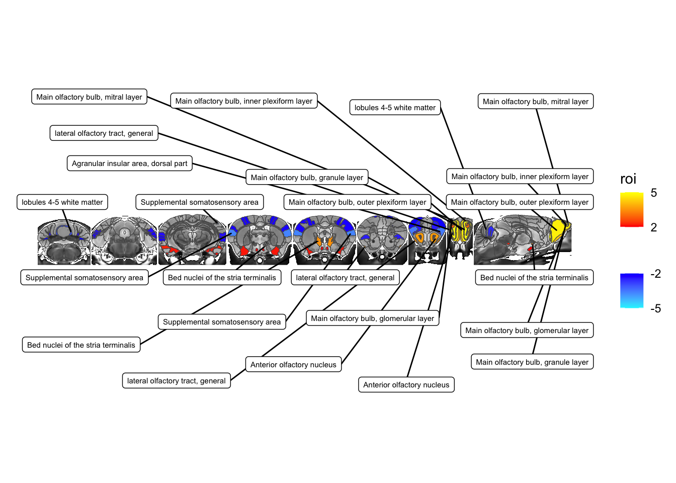
Making plots semi-interactive (by adding tooltips)
For one final example of what we can do let’s make our brain slices semi-interactive by adding tooltips that show the region and the t-statistic when hovering. We’ll go back to the earlier example of the faceted plot, and rely on the wonderful ggiraph package for interactivity. There’s two steps - replacing the geom with it’s interactive equivalent while adding the tooltip info, and then calling girafe to visualize it.
library(ggiraph)
sliceList <- MRIcrotome(nlin * (labelVol > 0), labelVol, hvols,
list(c(100,2), c(150,2), c(200,2), c(250,2), c(260, 2), c(300, 2), c(325,2), c(350,2), c(150,1)), assembleDir = "Y", sliceOffset = 5)
# get the different outputs from the hierarchical linear model
statsCols <- ToDataFrameTable(hlm, "name", "tvalue.GM", "tvalue.X", "tvalue.Y")
# now join them with the geometry
statsCols <- inner_join(sliceList$data, statsCols, by=c(region="name"))
# now we need to turn it into a long data frame
statsCols <- statsCols %>%
pivot_longer(cols=c(tvalue.GM, tvalue.X, tvalue.Y), values_to = "tstat", names_to = "statistic")
# start with a plain ggplot call
slicePlot <- ggplot() +
# use a function from tidyterra to display the anatomy
geom_spatraster(data=sliceList$anatomy) +
# set the grayscale fill colours
scale_fill_gradient("anatomy", na.value = "transparent",
low = "black", high = "white", limits = c(500, 1400), guide="none") +
# tell ggplot that the next fill will be independent
new_scale_fill() +
# plot the stats, now using the interactive geom
geom_sf_interactive(data=statsCols, aes(fill=tstat,
tooltip=paste0(region, ": ", round(tstat, 2)))) +
# use the positive and negative colours provided by MRIcrotome
scale_fill_posneg("t-statistic", low=2, high=5) +
# and facet by statistic
facet_grid(.~statistic) +
# and turn off graphic gunk
theme_void()
girafe(ggobj = slicePlot, width_svg = 7, height_svg = 5)